Take a moment to consider what device are you reading this on.
Is it your work laptop? Home desktop? Maybe you’re thumbing through this page smartphone in hand?
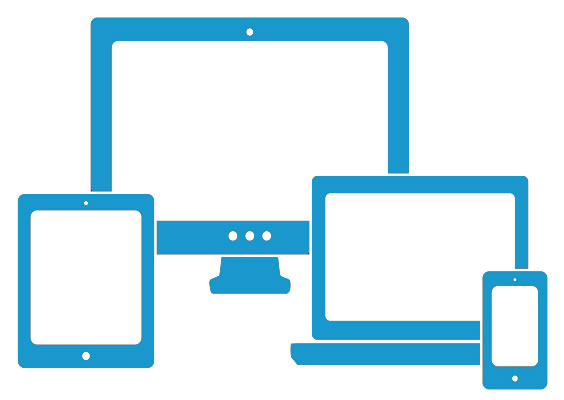
Today, it’s likely that your audience is viewing your website on any or all of these devices. This wide variety of screen types and sizes that your website can be viewed on creates a huge demand for responsive design.
Responsive design simply allows webpages to respond to the size of the screen or browser they are being viewed on. For example, an iPhone, tablet, Kindle, laptop, etc. will all display the glorious spectacle of a consistent, easy-to-navigate website.
Net Designs builds responsively designed websites that present beautifully no matter what size the screen. With Net Designs, you can feel confident that your customers will always be able to view your website in it’s best light. Read more about Responsive design in this edition of our blog.
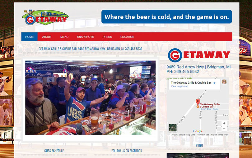
A Basic Site with Responsive Design
Getaway Grille & Cubbie Bar is an example of a basic site that presents well across all devices. Click the image below to view. Check it out on your phone, tablet, laptop, or desktop for a great viewing experience.